
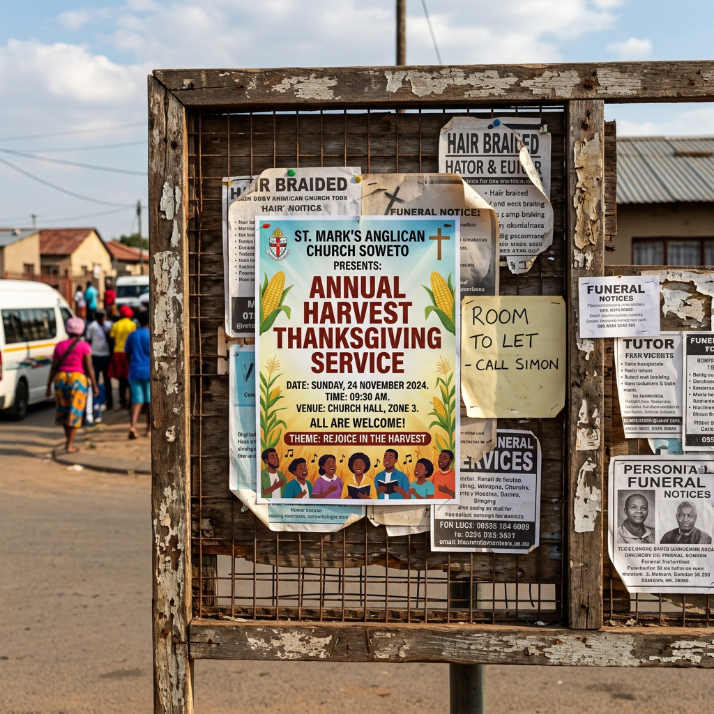
South African churches are some of the most design-savvy organisations in the country. Walk into any township, suburb, or city church and you’ll find posters, banners, and flyers that range from beautifully crafted to genuinely difficult to read. The difference between them is rarely budget — it’s almost always design thinking.
This guide is for church administrators, communications teams, and pastors who want to create event posters and promotional materials that actually work.
What Makes a Church Poster Different
Church posters carry a unique communication burden. They need to convey event information clearly, reflect the spiritual identity of the congregation, and compete for attention with secular visual noise — all while maintaining an appropriate tone. That’s a harder brief than it sounds.
The most effective church posters achieve this by being ruthlessly simple: one primary message, one dominant image or graphic, clear event details, and a single contact point. Everything else is decoration that competes with the message.
Design Principles for Effective Church Posters
Hierarchy: What Reads First?
When someone looks at your church poster for the first time, their eye will move from the largest element to the smallest. This hierarchy should match your information priority:
Event Name — largest and most visually prominent
Date and Time — second in size and placement
Venue — third
Speaker or Guest — if relevant, equally prominent to date/time
Contact / RSVP — clear but not competing with the event headline
If your poster has six different elements at similar sizes, nothing reads as important — and the eye gives up.
Typography for Church Communications
South African church communities are linguistically diverse. Many congregations span English, Zulu, Sotho, Xhosa, and Afrikaans speakers. If your poster includes text in multiple languages, ensure the typography is consistent across all — same typeface, same hierarchy rules, proportionally scaled.
Avoid using too many decorative fonts. One expressive display font for the event title, paired with a clean, highly legible font for all other information, is a pairing that works. Anything more complex than that usually degrades readability.
Imagery: Stock vs. Custom Photography
Many churches rely on stock photography for their posters. This works, but requires care. Generic stock images of multiracial hands, bright lights, and abstract worship scenes have become visual clichés in Christian design. When possible, use photographs of your own congregation — real faces build stronger community connection than stock imagery.
If photography isn’t available, abstract graphic backgrounds (geometric patterns, gradient washes, texture overlays) often work better than generic religious stock imagery. They don’t date as quickly and don’t risk the poster looking generic.
Colour and Spiritual Identity
Colour choices for church posters should reflect the nature of the event. A prayer and fasting week has different emotional requirements from an Easter celebration or a youth camp. Sombre events call for darker, more restrained palettes. Celebrations and festivals benefit from bold, joyful colour choices.
If your church has an established colour palette — common in larger denominations — use it consistently. Brand consistency across your communication materials builds recognition within your congregation and in the wider community.
WhatsApp Flyers: A South African Church Communication Reality
In South Africa, WhatsApp has become the primary communication channel for most churches. Announcements, event invitations, and service updates travel through WhatsApp groups at extraordinary speed. This has created a specific design consideration that doesn’t exist in many other markets: the WhatsApp flyer.
A WhatsApp flyer needs to work at the size it’s displayed on a mobile screen — typically 300 to 400 pixels wide on most devices. This means:
Text must be large enough to read without zooming
Image compression will reduce quality, so don’t design with subtle gradients or fine detail
Bright, high-contrast designs hold up better through JPEG compression
Keep file sizes under 1MB where possible for easy sharing
Design for vertical (portrait) format — horizontal posters don’t display well in WhatsApp chats
Print Specifications for Church Posters
Standard church poster sizes in South Africa: A3 (297 x 420mm) for notice boards, A4 (210 x 297mm) for handout flyers, and A2 (420 x 594mm) for entrance and foyer display. Design at 300 DPI, CMYK colour mode, with 3mm bleed on all sides.
For outdoor banners (common at South African churches for crusades and major events), design at 150 DPI minimum — higher resolution files become unnecessarily large and printers will downsample anyway. Outdoor vinyl banners are typically viewed at distance, so extreme resolution is less critical than for close-reading print.
Banner Design for Outdoor Events and Crusades
Large-format outdoor banners for crusades, revivals, and community events are a significant part of South African church communications. These materials are seen at distance, often from moving vehicles, so the design rules are stricter than for print:
Maximum two or three words in the headline — anything longer won’t be read
Speaker name and face, if a well-known figure, should be visually dominant
Date in large, clear numerals
Venue as briefly as possible (street name and area, not full address)
These same principles apply when thinking about event design across different sectors.
Building a Consistent Church Visual Identity
Beyond individual event posters, churches benefit enormously from having a consistent visual identity across all their communications. A defined colour palette, a logo or emblem used consistently, and a standard template for weekly bulletins and event materials create a sense of organisation and professionalism that reflects well on the congregation.
This is true across all organisations that serve communities — from churches to construction companies. Our article on construction company branding in South Africa explores how consistent visual identity builds long-term trust.
Final Thoughts
Church poster design in South Africa doesn’t require a large budget — but it does require intentionality. Prioritise hierarchy, choose legible typography, design for WhatsApp as well as print, and maintain consistency across your communications. The result will be materials that serve your congregation better and help your church’s events reach the people they’re meant for.


Leave a Reply